Quant
Mondern Investing App
Quant - is an investing app designed for modern investors — whether beginners or experienced traders — who want a clean, intuitive, and fast experience.
Client
Quant
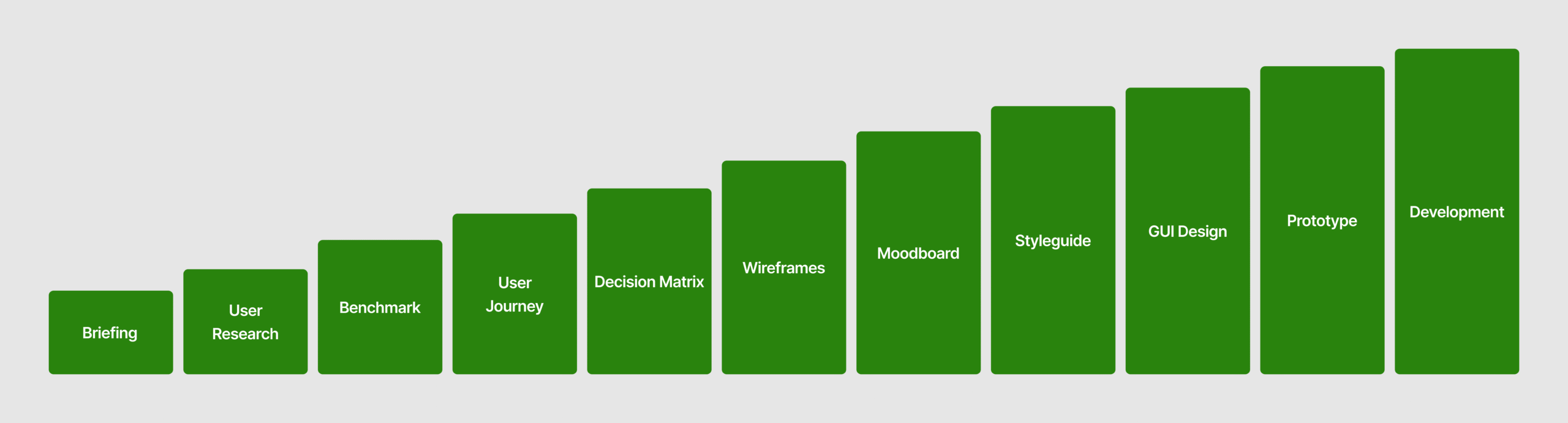
Services
User Research
UI/UX Design
Prototyping
Industries
Fintech
Date
June 2025
Objective
This project focused on three key areas: Reducing friction during onboarding, Designing clear and efficient in-app navigation, Creating a fast and confident stock purchase flow.
The Challenge
Most investing platforms are built for experienced traders — offering complex tools, crowded dashboards, and unintuitive navigation. Beginners often feel overwhelmed right from sign-up. The challenge was to design a streamlined onboarding experience, intuitive tab-based navigation, and an easy way to buy stocks, without sacrificing depth for advanced users.
The Solution
I designed Quant — a modern, minimal investing platform that prioritizes clarity, simplicity, and usability. The user journey focuses on: - A frictionless account creation flow - A clean low-bar navigation for quick access to core pages (Home, Market, Trade, Portfolio and Discover) - A one-tap stock buying process that makes investing approachable, fast, and clear
Product Design Process